Let there be white: Renovation Transformation keeps Stittsville home classic with a traditional twist
A renovation, almost entirely achieved through aesthetic changes, brings new life into a Stittsville home.
The colonial style house, built in the late 1990s, looked well past its due date prior to renovation. A grim yellow palette and natural reddish-toned oak was dominant throughout the home, which had a sunken living room and colonial columns that separated two spaces on the main floor.
With strong roots and a beautiful exterior the inside just needed a fresh start.
The homeowners hired the team at award-winning Artium Design Build to revitalize the home. Artium was so successful that the project took home first place in the category Renovation between $100,001 and $200,000 at the most recent Greater Ottawa Home Builders’ Association design awards.
“Being able to see a project transform so immensely that is primarily finishes, fixtures and furnishings is really incredible,” says Jenny Neilson, lead designer at Artium who described the transformed home as transitional in style with a contemporary edge.
One of the challenges in this home was the sunken living room floor, a full step down from the surrounding spaces. The traditional columns defined one side of the living area and allowed little flexibility for furniture placement.
The Artium team chose to raise the recessed area and remove the structural posts by installing a new steel beam, creating an open-concept space at the rear of the home. The kitchen and breakfast area now flow into the living room.
“Other than the major undertaking of the beam, the posts and the raising of the floor, we managed to really transform this space mostly by aesthetics,” says Neilson.
The floor is now a dark, rich wood and a white-on-white palette was used throughout creating a fresh and sleek appearance. Chrome details, used for light fixtures and doorknobs, add a “sparkle” to the new space and furniture chosen by the homeowners bring the transformation full circle.
The white palette was carried throughout the home after the completion of the master en-suite, which has huge white marble tiles covering the floor and walls. White details were used to ensure the marble details stood out.
Neilson said working with a white theme is harder than one might think.
“Trying to choose the white of the cabinetry to match the white and the tone of the white in the countertop with the white backsplash tile, for instance, in the kitchen is a challenge,” she says. “You end up with four white backsplash tiles from different manufacturers so you can make sure you have a cool white.”
While the purpose of the renovation was to give a modern update to the colonial-style home, Artium wanted to pay homage to its roots.
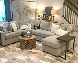
The staircase in the foyer has colonial banisters, the kitchen has classic shaker style cabinets and furniture chosen by the homeowners, like an antique rail cart repurposed as a coffee table in the living room, create a seamless transition between the home’s original style and a modern update.
Another major change was the cabinetry in the kitchen area. Where there was previously an angled lower cabinet is now a full-height pantry and fridge wall with a cozy coffee station between the kitchen and formal dining room.
This area, unlike the rear of the home, is not open-concept.
“We toyed around with completely blowing out the walls in the dining room and kitchen but sometimes it’s just really nice to have a space for a formal dining room and, also, sometimes when you lose the walls you lose some of the function,” explains Neilson.
All in all, she describes the project as a huge success because the details are consistent from space to space, tying the entire home together.
“The result is classic and clean with a beautifully traditional twist.”


